David Neeleman’s latest airline project, previously code-named ‘Moxy Air’, was officially unveiled as Breeze Airways on Friday.
The new Utah-based airline plans to launch flights in the US in mid-2020, using second-hand Embraer E195 jets that were previously in the fleet of another Neeleman-founded airline: Azul. Breeze will temporarily add a number of the Brazilian-made aircraft before taking delivery of its first Airbus A220-300 in 2021. It has 60 of those Airbus planes on order, making the airline one of the largest customers of the type, before even having taken off yet.
Breeze Airways’ plan is to operate on mostly unserved point-to-point routes between mid and smaller sized airports in the United States. While the airline does aim to compete with low-cost prices, it will reportedly also offer a premium product on its flights, similar to domestic first class – which is common on American legacy carriers.
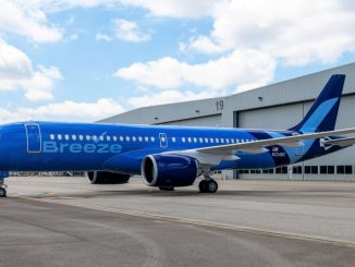
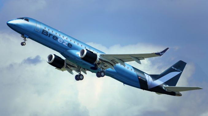
Its now-unveiled livery is all-blue, using three different tones, from bright to dark blue. The branding is stylized with a “check mark” above ‘ez’, which can also be found on the tail and winglets of the aircraft. Its appearance is quite different to common airline liveries, as it completely left out widely-used white.
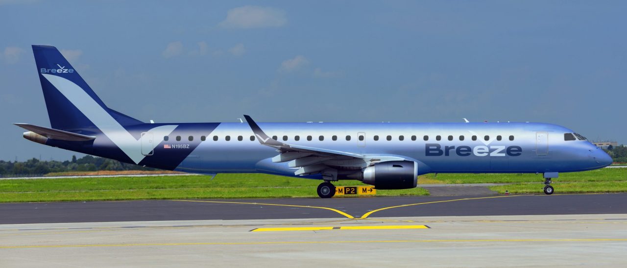
Breeze’s name, brand design and livery were created by Gianfranco “Panda” Beting, who also was a co-founder and designer of Brazil’s Azul Linhas Aéreas. Beting is an experienced marketing professional and has worked with many other airlines in the past, including creating their liveries and brand design. He is known for his aversion towards (almost) all-white airline color schemes, which are slowly becoming more common despite their unveiling often causing disappointment among the aviation community.
International Flight Network interviewed Beting on the branding of his latest project. He provided us with some insight on Breeze Airways’ name, brand and livery.
Why did you decide for ‘Breeze’ as the name?
Gianfranco “Panda” Beting: “We selected a name that could convey what we are aiming to do: offer a superior travel experience, as the name itself suggests: flying with us is like a breeze, nice and easy.”
Were there other serious considerations for a name, or was ‘Breeze’ set from the beginning on?
“I suggested Breeze on my first name list, about 18 months ago. Its not outrageously creative, but answers nicely to the briefing that was given to me back then: that the airline was aiming to create a better overall experience for its customers. That name reflects that. Of course, we had dozens of names suggested, many that were more bold and/or creative, but as you can imagine, it’s very hard to register and ‘own’ a name. We could do that with Breeze.”
How is the branding going to be integrated with the airline’s product?
“Hopefully it will be all intertwined. We want the Breeze experience to start with the brand look and feel, with its attributes and promises. The chosen name actually is a promise itself: flying with us has to be a breeze.”
What is the customer base you are trying to attract, specifically with the design?
“We wanted to appeal to a broad range of customers. We aimed to create a corporate identity that was bold, unique and yet elegant. We were not aiming to communicate with a specific target group. Anyone looking for affordable fares and great customer experience could be considered our target. And who isn’t?”
What is the check mark above ‘ez’ meant to represent?
“In English those two letters read as the word “easy” – we want our customers and fellow team members to have a nice and easy experience with Breeze.”

Why is the livery all-blue? What about other colors or combinations?
“First, blue is the world’s most popular color. It has very good connotations and is very appropriate when we think about air, about “breeze” and about the natural environment of an airline. It reinforces the concept of an easy, smooth experience. Last but not least, I personally wanted to reflect the legacy of David Neeleman: Blue is his favorite color, his trademark in the airline world. But we investigated many many other colors and hues. Until the very last stage of brand development, we had a few other colors in our pallette. But after careful consideration and a lot of debating, David Neeleman personally chose to stick with this “all-blues” image. I believe the final result conveys a very elegant image. We don’t have to shout, we prefer to whisper.”
The livery is quite different from what you typically see in the skies. Why is that?
“As a brand designer, with a few other airline liveries under my belt, I always aim to create corporate identities that stand out. I wholeheartedly believe it does not cost a penny to look unique. But if the “white is rite” concept is what you are looking for, you can always call the branding juggernauts on Main Street, pay them a few million dollars and end up with another “Eurowhite” corporate identity.”
How are you trying to differentiate from other airlines?
“That’s the secret sauce recipe. We will not comment on that.”
When are we going to see the first real aircraft painted in the livery?
“In a few months.”
Do you have any special liveries planned? Can you give us some details on those?
“You bet. But they won’t come out right now. And we obviously will not give any details at this stage.”

Jakob Wert is an aviation journalist from Germany. He built up the website IFN.news and is the Editor-In-Chief of International Flight Network.

